On the last post, we took a look at the city of Phoenix, AZ and the Valley Vista subdivision's 2013 to 2015 pertinent rental market figures.
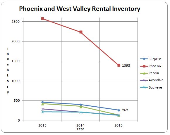
This week we will look at the same data but just look at some line charts that re-emphasize increase in rental price and decrease in rental inventory. These charts will show a graphical picture of the data for the following cities.
Surprise (SUR)
Phoenix (PHX)
Peoria (PEO)
Avondale (AVD)
Buckeye (BUK)
Keep in mind, the rental property data we use in this comparison is objective data that will look at focuses on closed, unfurnished rental properties and is taken from the Arizona MLS.
We will present two charts. The first chart shows raw rental price per square foot in each city.
The next chart shows rental property inventory.
 This chart details the significant reduction in rental properties available and also shows that the Phoenix rental property inventory is greater than the rest of the cities inventory combined.
